
Data visualization is a means of processing and transforming data and information into types of visual representation.
Our minds find it easier to interpret data and numbers when it is translated into maps and graphs. Using the right graphical representations, we can detect insights like trends and patterns.
You don’t have to be a data scientist to create, use and understand information visualizations.
There are many kinds of data visualization tools that can help you process large amounts of data into insightful formats. But in order to take advantage of the many benefits of data visualization, first you should understand its purpose and principles.
What is the purpose of data visualization?
The purpose of data visualization often depends on your objectives. If you have a large amount of data and a question that needs to be answered, a good map, graph or chart can help you answer it.
Data visualizations can also help you tell useful stories that highlight trends, outliers and patterns.
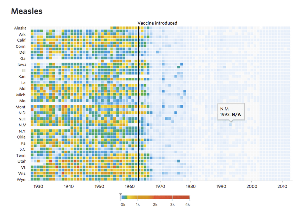
In data journalism, for example, the media seek to translate complex data into stories the public can understand. Professional data analysts have also sought to involve the public in interpreting and enjoying data that might otherwise be very dry and hard to access.
In learning analytics for education institutions, data visualization techniques can help educators interpret, analyze and even predict student behaviour and ongoing performance.
Why is data visualization important?
There is great promise in the use of data visualizations in many industries. Every industry can benefit from making data more understandable. In the end, that’s what it’s about – not the numbers themselves, but what you do with them.
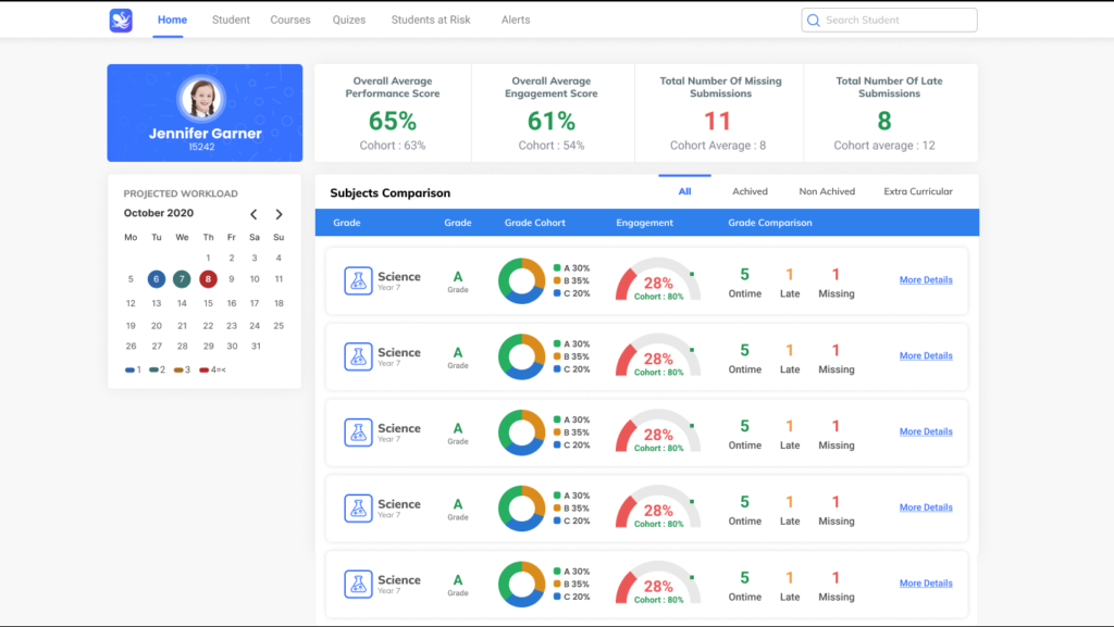
In learning analytics, the promise of data visualization lies in improving student engagement and teacher performance. Data visualizations like graphs and charts can help identify risks to mitigate, and opportunities to invest in. They can give teachers clarity and help them quickly make decisions about what students really need.
Every educational institution is collecting thousands of data points about their students every day. You have to do something with that data, not simply collect it and store it. You can create a shared understanding based on intelligence. You can tell a story.
By translating this immense amount of raw data into visual formats, educators and administrators are more easily able to understand and interpret otherwise invisible trends and patterns. This can apply to data sets of ten or ten million points!
And instead of waiting three to six months for a rough numerical update about student test performance, for example, teachers (and parents) can access visual insights much more often. That means they can help students faster and better.
If you have the right data visualization dashboards to process your student data, you can start to predict and decide upon what should happen next for real teacher and student success. That’s how you can turn data into outcomes.
What are the benefits of data visualization?
Today, with the availability of technology and tools, businesses can take advantage of data to create smarter strategies for the future.
Data-driven decision-making sounds like a buzzword, but all it really means is that you’re making decisions based on knowing rather than guessing.
Data visualization can make large amounts of data more accessible. With graphs, maps and charts instead of thousands of rows and columns of numbers, information becomes quick and clear. Our eyes are drawn to colors and patterns. Think of data visualizations like visual stories. A good data visualization can easily be worth a thousand words just like any other picture.
This will help you engage in data analysis and data exploration – essentially, look at all the relevant available information and make a conclusion or decision based on it.

As much as there is a wide variety of data and questions that can be asked of it, there is a variety of potential visuals, including:
- Pie charts, which can show relative sizes of data sets
- Heat maps, which can show color-coded overlays of attention on a webpage
- Line charts or line graphs, which can be used to track changes over a period of time
- Scatter plots, which can show cluster relationships between sets, points or pairs of data
- Bar charts or bar graphs, which can compare different groups or track changes over time
What are the three most important principles of data visualization?
Now that you know how useful data visualizations are, here are some easy principles to remember as you jump into using them for yourself. When creating visualizations, keep them simple, standard, and scalable.
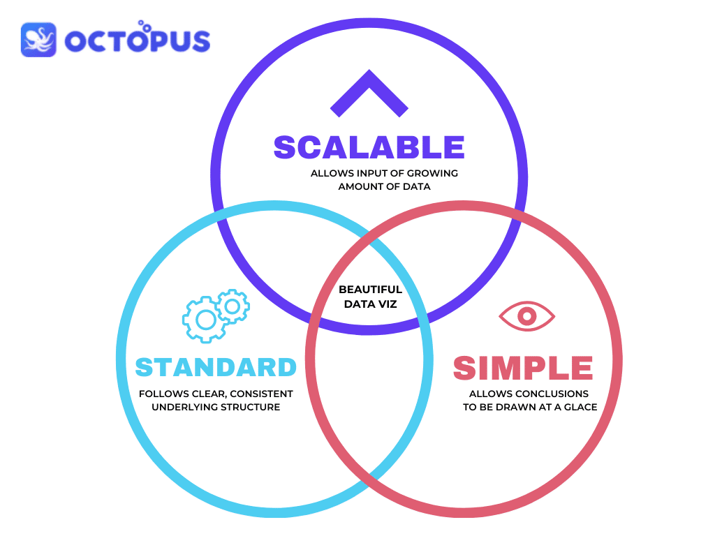
Simple visualizations are important for good visual reports. Don’t be afraid to use multiple visualizations rather than squeeze all the information into one, especially if the underlying data is complex.
Describe the purpose of your graph or chart in the header and label your X- and Y-axis with a consistent, logical scheme, with colors if necessary.
You should be able to draw a conclusion about your visualization at a quick glance.
The principle of standard visualizations refers to its underlying structure. Use common abbreviations and formatting that anyone reading your report will understand.
When creating multiple visualizations, use identical scaling for charts (such as 1-100 on the X-axis of each chart) to assist with clarity and consistency.
Visualization dashboards become much easier and faster to interpret when interpreters already know and trust the underlying structure.
In order to make scalable visualizations, your graphs and charts need to be able to accommodate a growing amount of data.
If you are tracking the test performance of one class over at least one year, for example, you will need to continue to add test scores as they become available.
If you want to track multiple classes or schools over multiple years, all you should need to do is input the data and update the visualization. If the visualization or graph needs to be redone every time new data becomes available, it’s not scalable.