At Octopus BI, we help businesses and schools integrate many sources of critical learning data into clear, visual dashboards of data visualizations where they can see all their information at a snap. This brings business intelligence into the realm of lifelong learning.
One of the most common things we hear from our customers is: What do other businesses or schools do with their data?
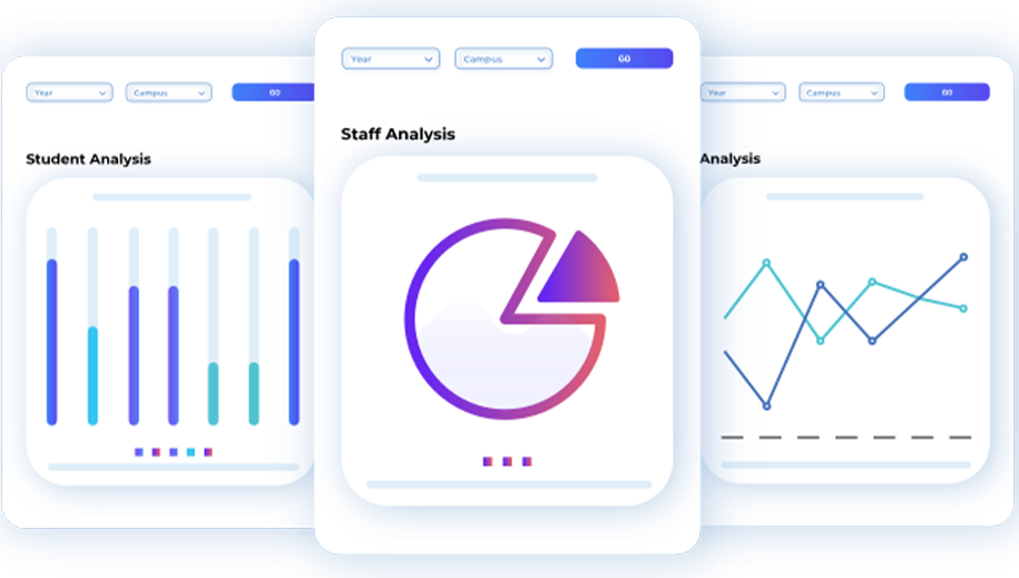
Having worked with hundreds of schools in 12 countries, we know the most common types of data visualizations and dashboards they want and the best ways to implement them. This goes beyond simple design factors like whether they prefer bar charts, line charts or pie charts, to the information displayed by these charts, and how it can then be used by these organizations.
Let’s dive into the needs that most commonly rise to the surface when it comes to data about learners, and the types of dashboards and data visualizations that can answer those needs.
Data Visualization #1 – Student or Learner Profile

The most common type of data visualization that schools and businesses require is a student profile or learner profile. This is a dashboard that integrates and visualizes all relevant data about a learner – their demographics, attendance, wellness, courses, grades and so forth.
This holistic view of a learner is critical at any age and level of education: it shows the teacher or course provider past and current performance, and with the right presentation – this type of data can flag future success or risk.
Data Visualization #2 – Student Benchmark or External Examination Dashboard
Every educational institution that participates in statewide or nationwide examinations can benefit from having access to benchmarking data visualizations, matching their learners with wider cohorts. This is one of the first things that learning analytics technology can make accessible to institutions.
These big data sets are useful for the purposes of understanding how students’ learning and learning processes compare with their peers in other institutions, and whether more needs to be done to close skills or knowledge gaps with their peers on a state or national level. Furthermore, the data could show a comparison between how a school is assessing internally and reveal how this compares to the benchmark.
Data Visualizations #3 & #4 – Cohort (class/course & year) Dashboards

Cohort views within an institution are incredibly valuable to the business or school, as they provide immediate and current views of the state of affairs of the learners they can directly impact. This is true for those employing learning analytics in formal higher educational institutions or and those providing more course-structured or self-directed learning in tertiary, vocational or corporate environments.
Data visualizations that incorporate various kinds of assessable data across a particular class, course and year group can give institutions insights into the success of particular courses and course material, teaching methods (like online learning), and wellness and behavioral data across the group. Having this data visualized and accessible makes the data actionable – group trends can be quickly identified, investigated and rectified if necessary.
Data Visualization #5 – Student Welfare Dashboard
Educational research has highlighted the importance of monitoring and responding to the needs of student welfare, wellness or wellbeing at all ages. Difficulties at home or work, with the coursework or fellow students, with physical and mental health – many factors can take a toll on a learner’s ability to focus and deliver their best.
Data visualizations that monitor and visualize student welfare can help identify potential growth and risk. This means that if there are downward trends apparent in the visualizations, organizations can swiftly organize interventions before the end of a training course or semester, hopefully correcting a learner’s growth and improving student retention and completion, rather than risk them dropping out either temporarily or for good.
Importantly, it can also help to flag health and safety issues within cohorts of children which could become catastrophic for the student, the family, and the entire institution if left unchecked.
Data Visualization #6 – Parental Dashboard
Creating a data visualization dashboard for external stakeholders (commonly parents, but also employers) to view the progress of the learner is a great way to keep those stakeholders engaged in the learning process. The digital avenue provides flexibility and real-time communication with the stakeholder as an alternative to stagnant periodic reports.
While parental engagement in particular tends to decrease as students age, studies have shown that continued interest in the learner’s progress can lead to improved outcomes at all ages. It is likely that adult learners can also benefit from supportive and well-informed learning environments in the workplace.
Data Visualizations #7 & #8 – Operational and Financial Data Dashboards

Data visualizations that are common between businesses and educational institutions of all kinds are those relating to operational data and financial data. Data sciences have long been employed to give businesses the best intelligence available to help them make informed, data-driven decisions. Education technology software providers have now adapted these processes to make them available to education providers of all kinds as part of the wider learning analytics suite. Being able to anticipate and fulfill the needs of the business as well as the needs of the learners is important to keeping learners learning!
What Else is Possible? Bespoke Data Visualizations and Dashboards
These common starting points provide great jumping-off platforms for new data projects. They help institutions providing any kind of education accelerate their decision-making and strategic thinking when it comes to learning and teaching, whether in childhood, higher education, or tertiary, vocational or corporate training.
It’s important to know that starting with templated popular dashboards doesn’t rule out bespoke data projects. It’s a simple, fast way to begin consolidating data and getting use from it, and it can help inform future decision-making around bespoke visualizations, tweaks or changes a business or school may realize they want or need.
“Now that I’ve seen this, can I have that?” is a great way to start having robust conversations inside your organization about phase two of your school’s data project. With OctopusBI, it means that you already have an experienced partner with knowledge of your data, who can help build exactly what you need.